

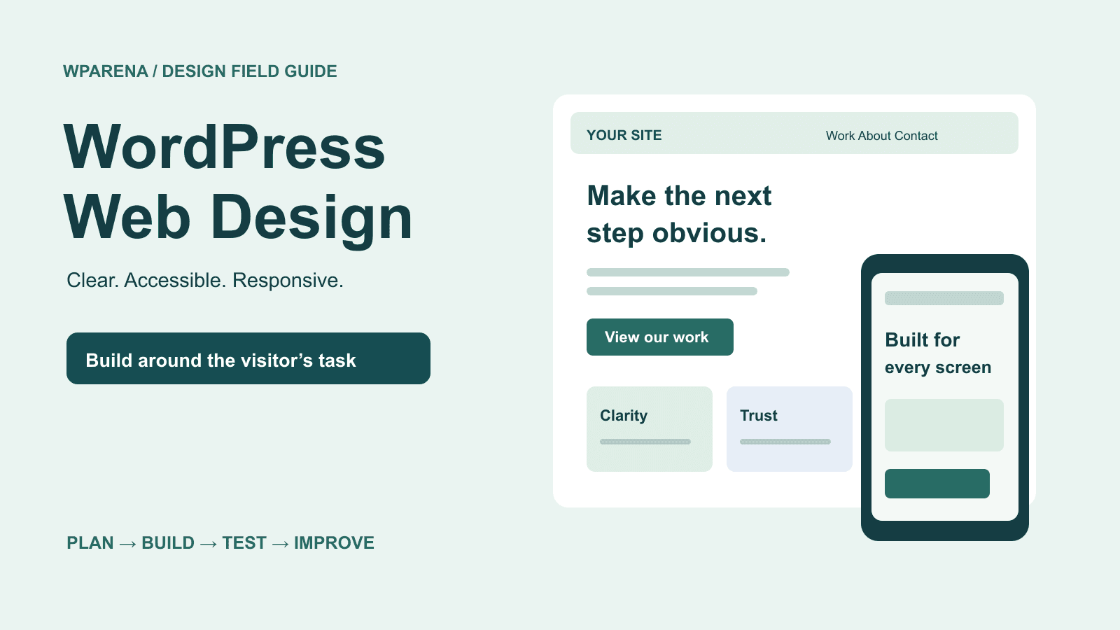
Build a WordPress website people can understand, use and trust.
A beautiful homepage is only the beginning. The navigation must lead somewhere useful, the article must fit a phone, and the contact form must actually deliver the message. This guide connects those decisions into one working design process.
WordPress web design is the work of turning content and visitor tasks into a usable website. It covers page structure, theme selection, navigation, typography, images, accessibility, responsive layouts and performance. Start with what someone needs to accomplish, build the smallest clear route to that outcome, then test the complete journey.
This guide is for business owners, bloggers, designers and developers improving a WordPress site. It includes separate instructions for block themes, classic themes and headless frontends, because a setting in one does not necessarily control the others.
Our editorial approach: WPArena publishes with WordPress and operates a separate headless frontend. That experience informs the distinction between editing content and changing the public interface throughout this guide. Examples below are illustrative design exercises, not claimed conversion experiments or tests of every theme on the market.
1. Write the design brief before choosing a theme
Write one sentence describing the visitor, the problem and the next step. For a local studio: “A small-business owner needs to see our work, understand the scope and request a quote.” For a tutorial site: “A WordPress user needs a reliable answer and a useful next lesson.” Those sentences lead to different homepages.
Then list the pages required to complete that task. A service business might need Home, Services, Work, About and Contact. A publication needs topic archives, articles, search and an author page. A store also needs categories, product information, delivery details, cart, checkout and account support. Avoid adding pages just because a demo includes them.
On a narrow screen, scroll the table horizontally to see every column.
| Website | Primary task | Useful evidence | Success measure |
|---|---|---|---|
| Service business | Request a relevant quote | Work samples, scope, team and process | Qualified enquiries, not just button clicks |
| Blog or publication | Find and understand an answer | Clear instructions, sources, author and dates | Helpful reading paths and returning readers |
| WooCommerce store | Choose and purchase a suitable product | Accurate photos, specifications, costs and policies | Completed orders and fewer avoidable support issues |
| Portfolio | Assess fit and contact the creator | Selected projects, role, constraints and outcomes | Relevant project conversations |
Record the current baseline before a redesign: important landing pages, search traffic, successful form submissions, orders, top support questions and performance measurements. Segment meaningful results by device. A decrease in enquiries can come from a broken form, a changed offer or different traffic; a new color palette will not diagnose it.
Decide whether you need repairs or a redesign
Repair a contained problem when the underlying system still works: fix a cramped menu, replace an oversized image, rewrite an unclear service page or remove an intrusive popup. Consider a broader redesign when important templates repeatedly fail on phones, editors cannot maintain content, the business has changed, or the theme’s structure obstructs necessary accessibility and performance work.
Choose the scope from evidence. Low rankings alone do not prove that the theme is the problem. Check indexing, content relevance, search intent and technical errors before paying for a complete rebuild. Our WordPress SEO guide covers that diagnosis.
2. Choose the right WordPress editing system
Open Appearance in the dashboard and establish what controls the public site. The presence of the block editor for posts does not, by itself, mean the active theme is a block theme. Your role, theme and plugins can also affect which controls appear.
On a narrow screen, scroll the table horizontally to see every column.
| Setup | Main design controls | What to verify |
|---|---|---|
| Block theme | Appearance → Editor; Styles, templates and template parts | Whether a change affects one block, a template or the whole site |
| Classic theme | Customizer, theme settings, Menus and Widgets where supported | Available theme locations and which settings the theme actually implements |
| Page builder | The builder’s page and template editor | Global styles, responsive controls, output size and behavior if disabled |
| Headless WordPress | WordPress for content; a separate application for presentation | Frontend templates, rendered HTML, API data, redirects and cache invalidation |
For a block theme, the Site Editor provides site-level editing. Use Styles to establish consistent colors, typography and layout rather than manually restyling every paragraph. Templates define recurring page structures; template parts let you reuse areas such as the header.
Before buying a theme, inspect an ordinary article, an archive, search results, a long title, a form and a narrow-screen menu. A polished demo homepage can hide weak everyday templates. Check maintenance history, documentation, support terms, accessibility behavior and the cost of required extensions. Compare the total setup you will operate, including hosting and recurring licenses.
Use core blocks when they meet the requirement. Add a plugin for a specific missing function, then test what it loads and whether another plugin already provides it. A cache, form or gallery plugin should solve a demonstrated need; installing a bundle of “essential” plugins is not a design process.
Keep customizations maintainable
Use theme settings and supported style controls first. For code changes to a traditional theme, use a child theme or another appropriate maintained extension point. Editing the parent theme’s files directly makes future updates harder and can lose your changes. Keep custom CSS small, documented and scoped to the component it fixes.
On a headless site like WPArena, changing a WordPress header template may not change the public header at all. The application must implement the design, receive the required content fields and refresh its cache. Verify the public URL after deployment; a successful WordPress save is only one part of the publishing path.
3. Build a clear homepage and reusable page layout
The first screen should explain what the site offers, who it is for and what to do next. Use a specific heading, a short explanation and a meaningful action. “Book a website consultation” is clearer than “Discover excellence.” Supporting imagery should clarify the offer rather than compete with it.
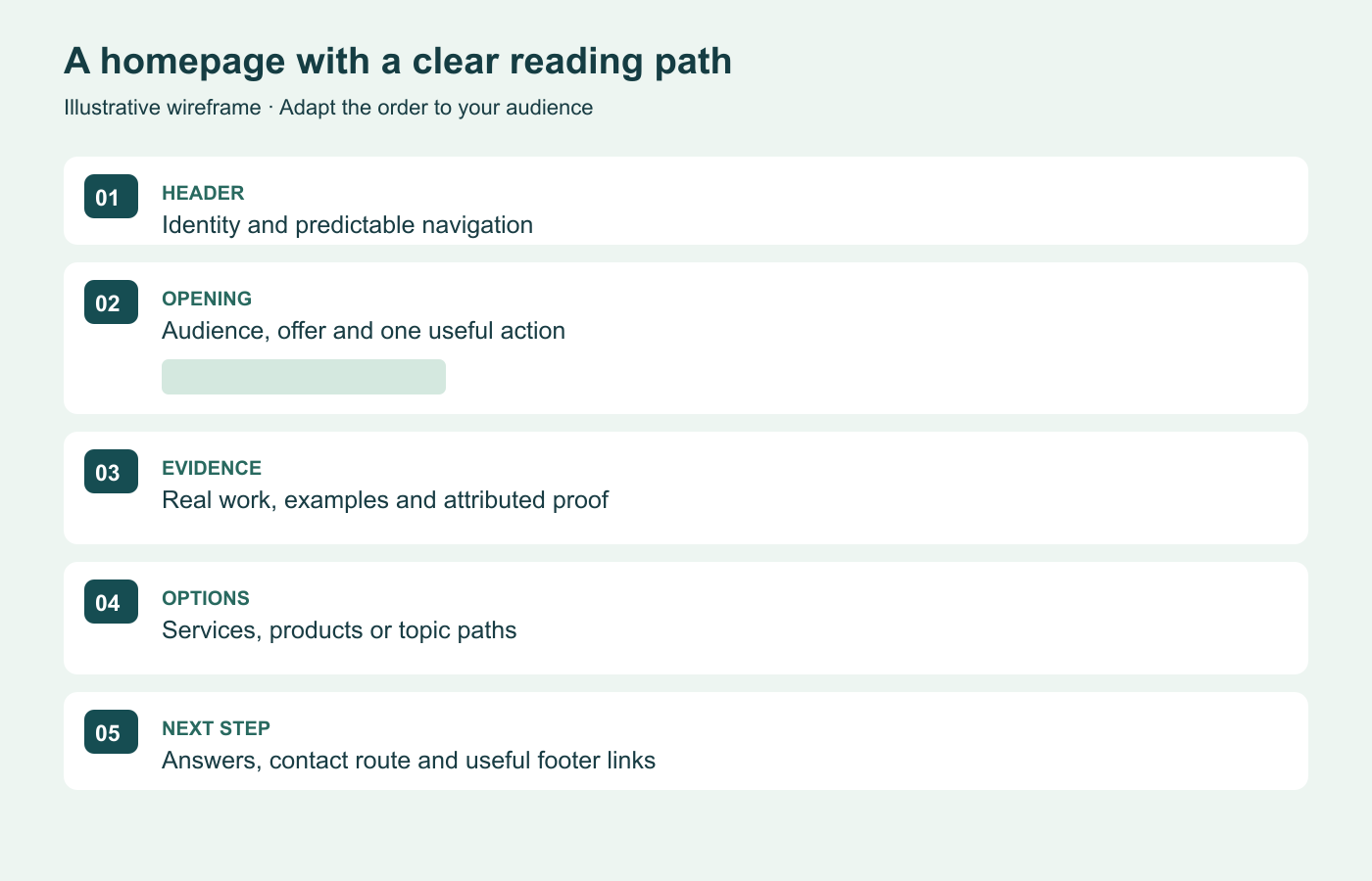
- Header: recognizable logo, concise navigation and an appropriate primary action.
- Opening section: the offer, intended audience and the next useful step.
- Evidence: a real project, sample, demonstration or clearly attributed testimonial.
- Options: services, product categories or topic paths labeled in familiar language.
- Questions: cost factors, process, suitability and practical limitations.
- Closing action and footer: contact route, business identity and relevant policies.
Place the most useful information early, but let the page be as long as the decision requires. A complex service may need detailed examples. A contact page usually does not need a long brand story before the form.
Example: improve a service homepage without adding effects
Unclear starting point
Headline: “We create digital experiences.” Five equally bright buttons. A full-screen animation. A testimonial with no identifiable source.
A visitor has to infer the service and choose between competing actions.
A more useful version
Headline: “WordPress websites for independent restaurants.” A short scope statement, selected restaurant work and one “Discuss your website” action.
Visitors can assess relevance, inspect evidence and understand the next step.
This is an illustrative rewrite, not a measured conversion claim. Test it with people who resemble the intended audience: ask what the business does and how they would enquire. Watch where they hesitate before explaining the page.
Use whitespace and alignment deliberately
Keep related information together and leave more space between unrelated sections. Align headings, paragraphs and controls to a small set of consistent edges. Use a comfortable reading width for long articles rather than stretching each line across a large desktop display. A starting point around 60–75 characters per line is a design heuristic, not a universal rule; test your actual font and audience.
Avoid ornamental layouts that reorder the reading sequence or cover text. Motion can help explain a change, but it should not be required to read the content. Respect reduced-motion preferences, provide controls where appropriate and do not autoplay background audio.
4. Make menus, headers and article navigation work together
Navigation is a promise about where a link leads. Use labels such as Services, Pricing, Guides and Contact when they accurately describe the destination. Keep the primary menu focused on frequent tasks. Move secondary company information and policies to appropriate footer groups rather than putting every page in the header.
Block-theme menu workflow
- Open Appearance → Editor and locate the header or template containing the menu.
- Select the Navigation block. Use List View if nested blocks are difficult to select.
- Select or create the intended menu. Add the required Page Link or Custom Link items, confirm their URLs and arrange them in a useful order.
- Create submenus only when the grouping makes sense. Check that the parent label and submenu control are understandable.
- Save the relevant changes, then test the public menu with a mouse, keyboard and phone-sized viewport.
Check which menu a header uses before changing it: multiple Navigation blocks can reference different menus. If a Page List automatically includes pages you do not want, replace that automatic behavior with deliberately selected links. Do not publish empty pages simply to populate a menu.
Classic themes and custom menu locations
Where supported, use Appearance → Menus or the Customizer’s menu controls. Create the menu, assign it to the correct theme location and save. Check whether automatic addition of new top-level pages is enabled; most carefully organized sites should review new links before adding them.
Developers adding a location to a classic child theme can register it during theme setup and render it with wp_nav_menu(). The minimal example below establishes the location; accessible submenu behavior and styling still need implementation and testing.
// In the child theme's functions.php:
add_action('after_setup_theme', function () {
    register_nav_menus(['primary' => __('Primary navigation', 'my-child-theme')]);
});

// In the appropriate theme template:
wp_nav_menu([
    'theme_location' => 'primary',
    'container' => 'nav',
    'container_aria_label' => __('Primary navigation', 'my-child-theme'),
    'fallback_cb' => false,
]);
Assign a menu to that location after adding it. Use a text domain matching your child theme. Do not paste PHP into a post’s Custom HTML block. Avoid reviving old Blogroll or hardcoded page-list solutions when the theme’s menu system already handles selection and ordering.
Test the complete navigation experience
- The logo should have an understandable home link and an appropriate accessible name.
- The mobile menu must open, expose its state, provide a usable close control and keep keyboard focus behavior sensible.
- A sticky header must not cover focused controls or the heading reached by a contents link.
- Long articles benefit from a contents list, relevant contextual links and meaningful previous/next titles.
- Archives need useful category labels, readable excerpts and working pagination. Search needs a useful no-results state.
- Breadcrumbs should reflect a genuine hierarchy. Avoid inventing dozens of thin categories just to create breadcrumb levels.
Hiding a menu item from logged-out visitors does not protect the destination. Restricted content and account actions need authorization checks on the server. Design choices cannot replace access control.
Fix overlapping previous and next links
If two long post titles collide, fix their container rather than inserting manual line breaks into individual titles. A scoped grid can shrink each column and wrap long text:
.post-navigation .nav-links {
  display: grid;
  grid-template-columns: repeat(2, minmax(0, 1fr));
  gap: 1.25rem;
}
.post-navigation a { overflow-wrap: anywhere; }
@media (max-width: 40rem) {
  .post-navigation .nav-links { grid-template-columns: 1fr; }
}
Adapt the selector to your theme’s markup and test when only one adjacent post exists. Labels such as “Previous article” plus the title provide more context than an isolated arrow.
5. Set typography, colors and links as a system
Start with a readable body typeface and a clear heading hierarchy. One font family with a few useful weights is often enough. Use consistent paragraph spacing, left-aligned long prose where appropriate and line height that keeps adjacent lines distinct. Check real paragraphs, numbered lists, tables, captions and form errors—not just a large headline.
In a block theme, use Styles for the global choices, then adjust specific block types only where they need a different treatment. The Font Library can manage available fonts in supported editor contexts. Confirm licensing and language coverage before uploading a font. A decorative font that lacks a customer’s name characters is a functional problem.
Loading custom fonts responsibly
If you maintain custom CSS, define the correct family, weight and style for each font file. Prefer a modern web format such as WOFF2 where suitable. A fallback font keeps text available while the custom font loads; compare its dimensions to reduce disruptive shifts. Load only the families and weights the design actually uses.
@font-face {
  font-family: 'Brand Sans';
  src: url('/assets/brand-sans-regular.woff2') format('woff2');
  font-weight: 400;
  font-style: normal;
  font-display: swap;
}
.article-body {
  font-family: 'Brand Sans', system-ui, sans-serif;
  line-height: 1.7;
}
This URL is a placeholder for your own licensed file. Inspect the browser’s network and computed-font information to confirm the file loads and the intended text uses it. Test accented characters, bold emphasis and a slower connection. For many sites, a system-font stack is a perfectly good choice.
Contrast is about states, not just a brand palette
WCAG’s minimum text contrast criterion generally calls for 4.5:1 for normal text and 3:1 for qualifying large text, with defined exceptions. Test actual foreground/background pairs, including links, captions, placeholders, errors and text placed on images. A gradient can make contrast vary across the same sentence.
Keep inline links recognizable without relying only on color; an underline is usually a straightforward choice. Provide visible focus indicators and distinguish hover, focus, visited and disabled states where relevant. Check both light and dark modes. Swapping the page background while leaving a white card’s text pale is a common source of unreadable blocks.
Use semantic headings to describe the content structure, then style their appearance. Do not choose a heading level only because its default font size looks right. Equally, do not simulate headings with bold paragraphs when readers need an actual section outline.
6. Use images that explain the page
A useful image demonstrates a result, identifies a product, shows a process or helps someone compare options. Replace generic stock photography when you have a more relevant, legally usable example. Keep a record of the source, license and any required credit; finding a picture through search does not grant permission to publish it.
- Featured images: choose a composition that remains meaningful in both article headers and small archive cards. Keep important details away from crop edges.
- Product and portfolio photos: show enough detail to support the decision. Do not stretch small files into large hero backgrounds.
- Tutorial screenshots: capture the actual interface being explained, remove private information and use a crop that preserves relevant labels.
- Diagrams: use them for relationships or processes that would otherwise need repeated explanation. Provide the key meaning in nearby text.
- Captions and alternatives: use captions for context or credit. Write alt text for the image’s purpose; decorative images generally need an empty alternative.
Export images close to the required display size and compress them without destroying important detail. Choose a format appropriate to the image and delivery system. Confirm that responsive image variants are actually delivered on the frontend and that dimensions reserve space before loading. Do not blindly lazy-load the main above-the-fold image if it delays the page’s key content.
A practical photography workflow
Keep original camera files in a separate, backed-up archive. Edit a copy, export a web-sized version, review embedded metadata for unwanted location or personal details, then upload it with a useful filename and caption. WordPress media storage should not be the only copy of your photographic work.
Begin with the core Image, Gallery and Post Featured Image blocks when they satisfy the layout. Test galleries on a phone and with a keyboard before adding lightboxes, sliders or additional scripts. If a gallery is central to the business, measure its loading cost with a realistic number of photos, not a three-image demo.
7. Make the layout responsive without hiding the useful content
A responsive site adapts its layout to the available space. Most WordPress sites should start with a capable responsive theme and fix the actual layout defect before installing a separate mobile-site plugin. An extra plugin cannot automatically make an inaccessible menu, fixed-width table or badly structured page usable.
Test narrow phones, wider phones, tablets and desktop windows. Also zoom text and the page. WCAG’s reflow criterion uses a width equivalent to 320 CSS pixels for vertically scrolling content, with exceptions for content that genuinely requires a two-dimensional layout. Put wide data tables in their own usable scroll region instead of allowing them to expand the entire page.
.content-grid {
  display: grid;
  grid-template-columns: minmax(0, 1fr);
}
.content-grid > * { min-width: 0; }
.article-body img { max-width: 100%; height: auto; }
.table-scroll { max-width: 100%; overflow-x: auto; }
.video-frame { aspect-ratio: 16 / 9; }
.video-frame iframe { width: 100%; height: 100%; border: 0; }
These are component-level patterns, not a universal repair stylesheet. Preserve a video’s real aspect ratio, give embedded frames appropriate titles and use provider controls that remain usable. If a page is wider than the viewport, inspect the offending element: common causes include fixed widths, long unbroken text, grid children that cannot shrink and third-party embeds. Hiding overflow on the whole document can conceal the defect and cut off content.
Keep important text, images, links and metadata available on mobile. Google’s mobile-first indexing guidance explains why a simplified mobile version should not silently remove the substance of the desktop page. A collapsed section can still be useful, but its content must be implemented accessibly and available to the intended rendering and indexing path.
Make touch controls forgiving
Give controls enough room for an accurate tap. WCAG 2.2’s minimum target-size criterion generally uses 24 by 24 CSS pixels, with spacing and other exceptions. Larger controls around 44 pixels can be a useful practical starting point for primary mobile actions; that recommendation is not the same as the AA minimum.
Check menus, checkbox labels, quantity controls, close buttons and links beside each other. Test with the on-screen keyboard open: the submit button and validation message must remain reachable. Avoid popups that cover the entire task on a small display.
8. Design landing pages and forms around one clear outcome
A landing page should match the promise that brought someone there. A resource-download page needs a clear explanation of the resource and what happens after submission. A service page needs suitability, scope and a contact path. A product page needs accurate product information and purchase details. Video may support any of these, but it should not replace all readable information.
Use an action label that predicts the result: “Request a quote,” “Download the checklist” or “View delivery options.” Place the action after enough information to make a sensible decision, and repeat it on a long page when helpful. Do not use multiple competing primary buttons merely to fill the layout.
Form design and verification
- Ask only for information needed at that step. Explain unusual or sensitive fields.
- Give each control a persistent label. A disappearing placeholder is not an adequate replacement.
- Use appropriate input types, autocomplete where suitable and plain-language instructions.
- Validate input on the server, show specific errors near the relevant controls and preserve entered data when possible.
- Make the success state explicit. Explain what happens next and provide another contact route when appropriate.
- Test a real submission with designated test data. Confirm the saved entry, notification or downstream delivery, then remove test records as appropriate.
On a headless WordPress site, a form that looks correct may still fail to reach the WordPress form plugin. Keep credentials on the server, validate requests, apply appropriate spam controls and verify the persisted entry. For paid submissions, publish only after the server verifies the payment event; the visitor reaching a success URL is not payment proof.
Use testimonials only with a genuine source and permission where needed. Explain what happened rather than implying that another customer’s outcome is guaranteed. Avoid fake scarcity, fabricated ratings and promises that every design change will raise conversions.
9. Improve performance using representative pages
Measure the homepage, a long article, a media-heavy page, an archive and any important transaction flow. Record the device profile and test conditions. A fast empty homepage says little about a product page with reviews, tracking scripts and a large gallery.
Core Web Vitals describe loading, responsiveness and visual stability. The “good” thresholds are LCP at or below 2.5 seconds, INP at or below 200 milliseconds and CLS at or below 0.1, assessed at the 75th percentile of visits. Field data reflects real visits; laboratory tools help diagnose a controlled run. They answer different questions.
On a narrow screen, scroll the table horizontally to see every column.
| Symptom | What to inspect | Useful first action |
|---|---|---|
| Main content appears late | Server response, hero image discovery, blocking styles and fonts | Find the actual LCP element and its loading path |
| Menus or buttons respond slowly | Long JavaScript tasks, builders, widgets and third-party scripts | Identify expensive work around the interaction |
| Content jumps while loading | Missing image dimensions, late embeds, ads and font changes | Reserve space and inspect the layout-shift source |
| Only some pages are slow | Template-specific plugins, queries and media | Compare an affected page with a similar unaffected page |
Reduce oversized images and unnecessary scripts before stacking optimization plugins. Check whether hosting, the CDN or another plugin already handles caching. Exclude personalized or transactional responses where required: serving one customer’s cart or account content to another is a serious failure, even if it makes a test faster.
Change one meaningful variable at a time, keep a rollback copy and repeat the affected journey. Test interactions after minification, deferred scripts or delayed JavaScript. A higher Lighthouse score is not a win if the menu or payment button stops working. A perfect score is neither a universal business goal nor a guarantee of rankings.
Review WordPress hosting options when the bottleneck is capacity or server behavior. Before database cleanup or a large plugin change, use a backup you can restore. Do not delete unfamiliar tables just because an optimizer labels them as candidates.
10. Keep the design friendly to search and editorial work
Use descriptive titles, a clear main heading, logical sections and ordinary crawlable links. Write content that answers the visitor’s actual question. Design can make that answer easier to find and read, but it cannot turn an irrelevant or unsupported article into a useful one. Google’s SEO Starter Guide is the baseline reference.
- Preserve useful URLs during a visual redesign. A new color scheme is not a reason to change every slug.
- Where a URL must change, map it to the closest relevant replacement with a permanent redirect and remove avoidable chains.
- Use consistent internal links, a correct canonical URL and a sitemap containing indexable destinations.
- Verify titles, descriptions, robots directives and structured data in the rendered public page.
- Make author identity, publication dates and meaningful update dates clear on editorial content.
- Keep staging protected and out of search, then verify the production indexing settings at launch.
Structured data should describe visible, accurate information. Do not invent review ratings or mark an ordinary article as a different content type to chase a search feature. Likewise, adding a FAQ section is useful when it answers real questions; it does not guarantee a special Google display.
Make the editorial system easy to maintain. Define image proportions, heading conventions, link practices and reusable patterns. Give each important page an owner and a review trigger, such as a changed product interface, an expired offer or a recurring support question. Consistent voice and useful updates matter more than publishing on an arbitrary schedule.
11. Common WordPress web design mistakes to avoid
- Starting with a demo instead of a visitor task. Write the brief and essential page list first.
- Making every section compete for attention. Establish one primary action and a visible information hierarchy.
- Hiding contact information. Provide an appropriate, working contact route in predictable places.
- Using pale text, tiny labels or color-only links. Test actual contrast, zoom and focus states.
- Letting tables or embeds widen the whole page. Fix component sizing and test narrow screens.
- Replacing readable content with autoplay media. Keep the essential explanation available as text and provide suitable alternatives.
- Installing plugins for problems the theme can already solve. Use the smallest maintainable set of tools.
- Publishing unsupported testimonials or performance claims. Use evidence you can explain and keep current.
- Testing only the first screen. Inspect the footer, long titles, forms, archives, empty states and checkout.
- Assuming a successful save means a successful release. Verify the public page, caches, persisted submissions and redirects.
- Chasing a score while breaking the task. Measure real journeys alongside technical performance.
- Launching without ownership or rollback. Document the changes, preserve a restorable backup and assign maintenance.
12. The WordPress design launch checklist
Use this as an acceptance checklist for a new site or redesign. Record the URL tested, device or viewport, result, owner and any remaining issue. Mark a check complete only when the behavior has been observed.
Content and identity
- The offer and intended audience are understandable without explanation.
- Important pages contain accurate copy, genuine evidence and current contact information.
- Headings follow a sensible structure; images have appropriate alternatives and credits.
- Logo, favicon, author information, dates and business details are consistent.
- No demo text, expired offer or unsupported rating remains.
Layout and accessibility
- Long titles, large text, lists, code and tables fit their containers.
- Narrow layouts work at 320 CSS pixels, with appropriate exceptions handled locally.
- Menus, dialogs, forms and important controls work with a keyboard.
- Focus remains visible and sticky elements do not obscure the task.
- Text, links, controls and errors remain legible in every supported color mode.
- Motion and media do not prevent reading or completing a task.
Functionality and publishing
- Contact and newsletter forms save or deliver a test submission successfully.
- Search, archives, pagination, previous/next links and the 404 page provide useful routes.
- Accounts and restricted content enforce permissions beyond menu visibility.
- Where relevant, cart, payment failure, confirmed payment and order delivery have been tested safely.
- WordPress changes appear on the public frontend after cache refresh.
- Critical images load at appropriate sizes without blocking the primary task.
Search, measurement and recovery
- Important public URLs return the intended response and correct canonical.
- Retired URLs redirect directly to relevant replacements; internal links point to final URLs.
- Production indexing settings and the sitemap are correct.
- Performance was checked on representative templates, with lab and field results labeled accurately.
- Analytics measures meaningful outcomes and follows the site’s consent requirements.
- The backup, restore instructions and deployment rollback point are available to the responsible person.
Start with the design brief Continue to WordPress SEO
13. Maintain the design after launch
Review real support requests and observe where visitors struggle. Check important forms and links regularly, especially after theme, plugin or frontend updates. Examine device-level changes in enquiries, orders and engagement before attributing a result to design.
Keep a short change log: what changed, why, which pages were affected, how it was verified and how to reverse it. When testing a new layout, define the intended outcome before looking at the result. Small audiences may not support reliable statistical comparisons; direct usability observations can still reveal confusing labels or broken steps.
For a new site, use our WordPress launch guide. For a store, continue with WordPress ecommerce. If you plan to add commercial offers, the monetization guide explains how to fit revenue to the visitor’s reason for being there.
WordPress web design questions
Frequently asked questions
Can I design a WordPress website without coding?
Yes. A suitable block theme, core blocks and the Site Editor can handle many layouts. You still need to plan the content and test the result. Custom integrations, unusual interactions or a headless frontend may require development work.
Do I need a page builder?
Only if it solves requirements your existing tools do not meet well. Compare editor usability, template control, performance, accessibility and long-term maintenance. A builder is one implementation choice, not a prerequisite for a professional site.
Why is my WordPress page wider than the screen?
Inspect fixed-width elements, wide tables, embeds, unbroken URLs and grid or flex children that cannot shrink. Correct the responsible component and retest. Globally hiding horizontal overflow can make the page appear fixed while cutting off content.
Should I install a mobile plugin?
Start by checking the theme and the actual defect. Responsive layouts are normally part of the theme or frontend. A mobile plugin may serve a particular requirement, but it is not a general replacement for correcting navigation, typography or container widths.
Will a new design improve Google rankings?
It can remove usability and technical obstacles, but rankings also depend on relevance, content quality and many other signals. Preserve URLs, fix real problems and monitor results. No theme, redesign or article length can guarantee first place.
How often should I redesign?
Use evidence rather than a fixed calendar. Repair isolated problems continuously. Consider a larger redesign when the business, content structure or underlying technology can no longer support the tasks visitors and editors need to complete.
What should I fix first on an existing site?
Fix failures that stop the main task: unusable menus, unreadable content, broken forms, failed checkout or missing pages. Then address performance and clarity on important journeys. Cosmetic refinements come after the website reliably works.
Decide whether to repair, refresh, or redesign
Repair a site when a limited component is broken, refresh it when the visual system feels dated but the information architecture works, and redesign it when navigation, templates, content structure, or business goals have changed. Record baseline conversions, search traffic, important URLs, and accessibility problems before changing templates.
A professional WordPress design uses consistent spacing, typography, color, focus states, image treatment, and content hierarchy. Creative effects should explain the brand or interaction. Parallax motion and social embeds add rendering and accessibility costs; provide reduced-motion behavior, avoid hiding essential information inside an effect, and test on a real phone.
Use social photography only with permission, meaningful alternative text, and a stable fallback when an external embed fails. A polished homepage still needs a clear next step, readable article templates, fast media, and navigation that works with a keyboard.



Responses (1 )