

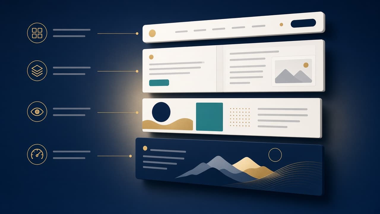
Some websites feel instantly clear. You land on the homepage, know where to click, and find what you need without extra effort. Other sites make you work for it, scrolling through clutter, guessing at menus, and waiting for pages to load.
The difference usually comes down to how well small elements work together – things like navigation, page speed, visual hierarchy, and content structure. Each part plays a specific role, and when they line up, the site feels effortless to use.
Visitors don’t analyze these details consciously. They just notice the result, which comes in the form of a page that guides them toward what they came for, or one that leaves them clicking around in frustration.
Read on as we break down the core components behind a smooth digital experience.
Clear Audience Pathways Help Visitors Find What Matters to Them
Visitors don’t all arrive at a website with the same goals. Some come to learn, others come to compare, and others show up ready to act. A website that sends everyone down one single path forces people to sift through content built for someone else.
This gets costly fast on sites serving multiple sides of a transaction or marketplace, where one group needs technical details and another needs reassurance instead.
Clear pathways solve this early. Labels such as “For Buyers” and “For Sellers” let visitors self-select before reading a paragraph meant for someone else, so each path speaks directly to that visitor’s goals and vocabulary.
1. Set apart the distinct types of visitors your site actually gets, and note what each group needs to see first.
2. Add clear entry points on your homepage and navigation menu, using labels that match how visitors describe themselves rather than internal jargon.
3. Once someone picks a path, keep the content, tone, and CTAs consistent with that choice all the way through.
4. Test your labels with real users to confirm they point people where you expect them to go.
An example of a brand that applies this is CapitalPad, a private equity group that lets accredited investors invest in private equity deals .
Its website splits into separate paths for investors and independent sponsors raising equity for their acquisitions. Investors see minimum commitments, deal review steps, and how to apply for access, while sponsors see fee structures, funding amounts, and submission requirements for their own transactions.
Neither group bothers with the details meant for the other, and each finds relevant next steps right away.
Compatibility-Based Navigation Simplifies Complex Product Choices
Ecommerce navigation works best when it reflects the details customers use to judge fit. Generic categories fall apart quickly in catalogs where compatibility matters, leaving shoppers to compare dozens of products that don’t fit their situation.
For instance, shoe buyers don’t want a list of every shoe in stock. They prefer options that suit their needs. Filters, model-based navigation, and clear specifications narrow that list before anyone reaches a product page, cutting uncertainty and wasted searching.
This works much like faceted search , which lets users refine results by applying filters that cover the relevant attributes of a search space, a narrowing that matters most in large catalogs.
1. Look at the attributes your customers rely on most when choosing between products, whether that’s size, model compatibility, or technical specifications.
2. Build your filters and category structure around those attributes instead of generic groupings.
3. Place compatibility filters near the top of the navigation so shoppers can narrow results right away.
4. Add visual cues, like model diagrams or category icons, to help customers confirm they’re on the right track before they click into a specific product.
Golf Cart Tire Supply, an online retailer of golf cart accessories , structures its catalog around this exact need.
Its navigation splits products by type and brand right from the start, so a buyer with a specific cart model can skip straight to compatible options. Visual category representations reinforce these splits further down the page.
They also include a sidebar with extensive category options alongside the main content, letting customers jump directly to the products they came looking for.
Familiar Design Patterns Make Websites Easier to Use
Visitors carry a mental map of how websites work before they land on yours. They expect a search bar near the top, a menu that reveals categories, breadcrumbs that show location, and buttons that look clickable.
When a site follows these conventions, people move through it without stopping to figure out the interface.
Originality has real value, but it shouldn’t cost usability. A striking menu that hides basic navigation, or a button that doesn’t look like one, forces visitors to pause and guess where to go next. That pause creates friction, which pushes people toward a competitor instead.
1. Before designing a new interface element, check how established sites in your industry handle the same task.
2. Lean toward those patterns unless you have a strong reason not to.
3. Keep your logo in the top left, your main menu visible, and search easy to spot.
4. Save your creative energy for your brand voice and content instead of reinventing basic controls.
5. Run usability tests with real visitors to confirm they can complete common tasks without help.
Faire, a wholesale marketplace connecting independent retailers with makers, demonstrates this principle throughout its platform.
Their navigation follows familiar patterns with clear categories, standard search placement, and predictable product page layouts. Retailers browsing for inventory can focus on discovering unique products rather than learning how the site works.
This approachability proves especially valuable for their audience of small business owners who need efficient ordering without interface friction.
Problem-First Service Design Turns Complexity Into Clear Next Steps
Service websites often assume visitors already know the exact name of what they need. That assumption creates friction for people who understand their problem but not the industry term attached to the solution.
Effective service sites start with the problem instead of the label, connecting recognizable situations to the right offer and explaining what happens once someone signs up.
This matters most for services with specialized names, where a confused visitor is more likely to leave than to search for unfamiliar terms.
1. List the situations that lead someone to your service, described the way a customer would describe them, not the way your industry does.
2. Use those descriptions as headlines and menu labels across your site.
3. Under each one, lay out the next step clearly, whether that’s a quick form, a phone call, or a consultation.
4. Avoid burying the actual offer behind jargon on the homepage.
5. Save formal terminology for pages visitors reach once they already understand what they’re getting.
Start in Wyoming, which handles LLC formation and registered agent services for out-of-state and international business owners , frames its site around a specific fear rather than a formal service category.
Instead of leading with business formation terminology, its pages warn visitors that shared or low-quality business addresses get flagged by banks, causing account rejections and unexpected delays.
That underlying problem, not the formal service name, drives visitors toward the company’s verified office address and its formation packages.
Fast, Accessible Experiences Remove Invisible Friction
An effortless website depends on more than clear navigation and structure. Page speed, mobile usability, readable text, sufficient color contrast, keyboard accessibility, well-labeled forms, and stable layouts determine whether visitors can complete a task without extra effort.
These fundamentals need to hold up across devices and for people with different accessibility needs, not sit at the bottom of a launch checklist.
Google’s own research backs this up. As mobile load time stretches from one second to ten, the odds of a visitor bouncing before the page finishes loading rise sharply. The same research found pages weighed down with too many elements saw conversion rates collapse.
1. Use a speed testing tool on your pages and repair the elements that slow them down. Large images and unnecessary scripts are typically the primary causes of slow performance.
2. Test every page on a physical phone rather than relying on a resized browser window.
3. Verify that color contrast meets accessibility standards.
4. Ensure every form field has a clear label.
5. Confirm that the site is fully functional using only a keyboard.
6. Perform these checks as you develop each page instead of treating them as a final step.
Figma, a collaborative design platform , is a strong example of this principle.
Their site earns a high accessibility score. They remain compliant with every guideline, implementing screen reader support, keyboard navigation, and contrast toggles that are built into the interface.
Figma also bakes accessibility checks directly into its design tools, letting teams catch contrast and legibility problems before anything ships.
The site also maintains fast load times considering the amount of visitors and users they get.
Decision-Critical Information Should Appear at the Point of Action
Great websites anticipate questions that could stop someone right before they act. Availability, pricing, provider details, location, and what happens next belong close to the booking or inquiry action, not scattered across separate pages a visitor has to hunt down.
Every extra click to find a price or confirm a provider is a chance for hesitation to take over. This matters even more for sensitive or emotionally difficult decisions, where visitors are already carrying stress and don’t have the patience to piece information together from multiple tabs.
Placing answers to their biggest concerns right where they act removes a barrier when they have little capacity left to overcome one.
1. List every question a hesitant visitor might ask right before committing.
2. Place the answers directly next to your main CTA instead of linking out to another page.
3. Show pricing, timing, and who’s involved up front.
4. If your service involves a person, include their name, credentials, and a short bio near the booking step.
5. Test your own action page by pretending you know nothing about your business and checking whether it answers your own doubts.
CodaPet, which connects grieving pet owners with veterinarians for in-home euthanasia, builds its local pages around this exact idea.
Its Orange, California location page shows starting pricing right at the top, followed immediately by profiles of nearby vets with photos, bios, and ratings, and a booking button placed directly below both.
This way, visitors never need to leave the page to compare providers, check costs, or start scheduling, even during one of the hardest decisions they’ll face.
Final Thoughts
Nobody tells a friend about the website that just worked. People remember the one that made them redo a form three times, or the one that hid pricing until checkout.
That’s the trade every design choice makes. Get it right, and your site disappears from the conversation entirely, replaced by whatever the visitor actually came to do.
Start with one principle that addresses your biggest friction point. Test changes with real users, measure results, and refine continuously. Your website can become a place where visitors accomplish their goals with confidence, returning whenever they need what you offer.
Responses (0 )