• Skip to primary navigation
  • Skip to main content
  • Skip to primary sidebar
  • Skip to footer
WPArena

WPArena

WPArena is a premium online resource site of WordPress and is focused on providing excellent WordPress Tutorials, Guides, Tips, and Collections.

  • News
    • Opinion
  • Tutorials
  • Reviews
    • Themes
    • Plugins
  • Comparisons
  • Collections
    • Education Themes
    • Genesis Child Themes
    • Best Responsive Themes
    • Medical WordPress Themes
    • Finance & Business Themes
    • Crowdfunding Themes
  • Resources
    • Inspiration
  • Services
WPArena » Tutorials
Tutorials

Typography – The Absolute of Professional Graphic Design

Avatar of Editorial Staff Editorial Staff Updated: May 15, 2018

Typography - Professional Graphic Design
FacebookTweetPinLinkedInEmailPrint

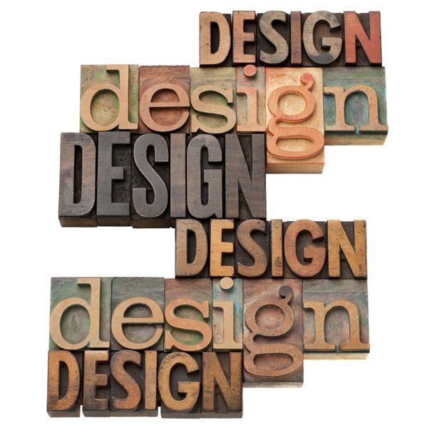
Typography is a technique of arranging typefaces and fonts for the goal of making written language not only easily readable but also very appealing to the eye. It is an art that requires special skills and, most of all, a lot of creativity. Typography is one of the essential techniques that every graphic designer must master to make their every design impeccable.

The typeface you choose and the way you try and make it work with your design theme, color scheme, grid, and layout is exactly what will make a huge difference in your designs and determine their ultimate quality. That is why you need to know the basic rules of typography so that you can make sure that everything you create that has a headline or some other typographic element results not only in a good design but also in a fantastic design.

Therefore, take a look at the basics of typography that will help you learn how to become a professional graphic designer who will know exactly how to create the best possible designs to capture the eye of every beholder.

The Difference between Fonts and Typefaces

Before you delve deeper into typography, you need to know the absolute basics. Do you know the difference between fonts and typefaces? A font represents a group of typefaces with similar characteristics, while a typeface is an individual member, so to speak, of a particular font.

Here is an example of the Gotham font, along with its typeface variations, so that you can better understand the difference.

For you to be able to make the best decision regarding fonts and their typefaces, you should know those that represent the big players in the field. Some of the most popular fonts are Display, Hand Lettering, Serif, Sans Serif, and Script.

A Display font is often used in newspaper headlines, on movie posters, and banners. Its goal is to instantly capture the attention of viewers and emphasize a particular area. However, it doesn’t work well in large quantities, so it should never be used as a body copy.

Hand lettering is a font that looks like someone’s handwriting, which adds a human element to a particular design. That is exactly why a lot of graphic designers use it so that they can engage people and make them relate to their designs.

A Serif font differentiates itself by the projection at the end of a stroke, which you can typically see at the bottom of the letters. On the other hand, Sans Serif doesn’t have those little “feet” at the bottom. It usually looks more modern than Serif, but it can be hard to read at a small size.

Script tends to look professional, and it is one of the most elegant fonts out there. It is usually used for wedding invitations, as well as for certificates and diplomas. However, this font doesn’t work well at small sizes, and it shouldn’t be used as a body copy.

How to Choose a Font?

Choose a Font

There are quite a lot of different fonts you can choose from, many of which are breathtaking, which can make choosing the right font for a particular project very daunting. How can you choose the one that will work best with your overall design? The key, of course, is to have a creative intuition, but you also need to have certain typographic considerations in mind, so here are the essential ones.

1. Size

When you are pairing different typefaces, you need to consider their height (known as x-height) and their width (knowns as set width). You should use typefaces that are similar in height and, regarding width, you need to watch out for the buffer space between letters to perfectly pair the chosen typefaces.

2. Leading

Leading represents the vertical space between type lines and, to make your text easily readable, you should make sure your leading value is 1.25 do 1.5 times greater than the size of your font.

3. Tracking

Tracking refers to the act of spacing the characters, which should be done evenly.

4. Kerning

Kerning is similar to tracking, but it represents the adjusting of spaces between characters. Take an uppercase “A” and an uppercase “V,” for instance. You need to pair them in a way that their diagonal strokes are perfectly kerned.

5. Measure

You need to consider the measure if you want your readers to be able to read your text for the best possible experience. Measure refers to the width of a text block.

6. Hierarchy

You need to achieve an ideal hierarchy, which you can do with size, spacing, weight, and color. For instance, you need to include typefaces of different sizes for a large body copy, so that the headings can be emphasized by being the largest, while sub-headings and body type are smaller (the latter being the smallest).

The Most Important Terms You Need to Be Familiar with

There are a lot of terms and concepts in regards to typography that you must be familiar with, so make sure you explore them all before you can start working on your first project. Here is a visual representation of the most important ones, but have in mind that a glossary of typographic terms includes many, many more of them, so make sure you check them all out.

You certainly understand the reasons why typography is your magic bullet. It can make each and every one of your designs look astonishing, and it can provide them with a unique personality that will instantly grab the viewers’ attention. That is why it is crucial to learn all of the typography rules and to know exactly how to apply them in a variety of situations so that they can always result in the most stunning and creative designs. Therefore, make sure you delve deeper into the matter, as the basics above represent just the tip of an iceberg.

This post was orginally published on: May 8, 2017 and was updated on: May 15, 2018.

Related Tags: Graphic Design Typography

FacebookTweetPinLinkedInEmailPrint

Related Stories

  • WordPress Under Attack | Upgrade WordPress Blog

    WordPress Under Attack | Upgrade WordPress Blog

  • This Is Why You Should Use WordPress for Your Ecommerce Site

    This Is Why You Should Use WordPress for Your Ecommerce Site

  • Make Blog Post From Mobiles With WordPress Mobile Apps

Avatar of Editorial Staff

Editorial Staff

Editorial Staff at WPArena is a team of WordPress experts led by Jazib Zaman. Page maintained by Jazib Zaman.

Reader Interactions

Share Your Thoughts Cancel reply

Before submitting your comment, we kindly ask that you read our comment policy. Your email address will remain confidential and will not be published or shared anywhere. If you subscribe, you will receive notifications regarding new comments.

Primary Sidebar

WordPress Version Updates

WordPress Version 2.8 Now Available

captainform Review

CaptainForm Review: The Ultimate Plugin For Creating Forms & Surveys

Recent Topics

  • Official Windows 7 Wallpapers
  • How to secure your WordPress images and content from Theft
  • Top 20 Web Designing Companies in the World
  • WP Rocket Review: Is It the Perfect Solution for WordPress Caching?
  • The Complete WordPress Security Guide 2023 – Step by Step

Footer

Top

  • Services
  • Our Themes
  • Facebook
  • Twitter
  • Linkedin

Reviews

  • Beaver Builder Review
  • Beaver Themer Review
  • WP User Frontend Pro
  • Ninja Forms Review
  • MemberPress Review

More Reviews »

Resources

  • Best WordPress Plugins
  • WordPress Permalinks Structure
  • Email Management System
  • Envato Free Files
  • Advertise
  • Write for us
  • Disclosure
  • Terms
  • Privacy
  • Contact

Copyright © 2023 · All Rights Reserved · WPArena is a Project of TechAbout LLC.
We are not affiliated with Automattic or WordPress.

  • Advertise
  • Write for us
  • Disclosure
  • Terms
  • Privacy
  • Contact
Share this ArticleLike this article? Email it to a friend!

Email sent!