


Updated for 2026
Best Responsive WordPress Themes for 2026
Responsive design is no longer a bonus feature. A WordPress theme has to work across mobile, tablet, laptop, desktop, touch navigation, fast networks, slow networks, and modern block-editor workflows.
The old version of this guide listed responsive themes that made sense years ago, when being mobile-friendly was still a headline feature. In 2026, almost every serious theme says it is responsive. The real question is whether the theme is fast, actively maintained, accessible enough, compatible with the editor you use, and practical for the site you are building.
This update folds our old Responsive theme review, Responsive Business review, responsive media note, and older Bootstrap responsive-theme tutorial into one practical guide. The result is focused on themes that are still active, current, and useful for real WordPress projects.
Quick picks: which responsive WordPress theme should you test first?
| Need | Theme to start with | Why |
|---|---|---|
| Most business websites | Astra, Kadence, Blocksy | Strong responsive defaults, templates, and broad plugin compatibility. |
| Performance-first blogs | GeneratePress | Lean starting point with clean layout control. |
| WooCommerce | OceanWP, Astra, Blocksy | Better store-focused controls and demo ecosystems. |
| Elementor builds | Hello Elementor | Minimal theme base when Elementor controls the design. |
| Core WordPress workflow | Twenty Twenty-Five | Block theme that stays close to WordPress core. |
| Beginners comparing free themes | Responsive, Sydney, Zakra, Hestia | Good free starting points with different design styles. |
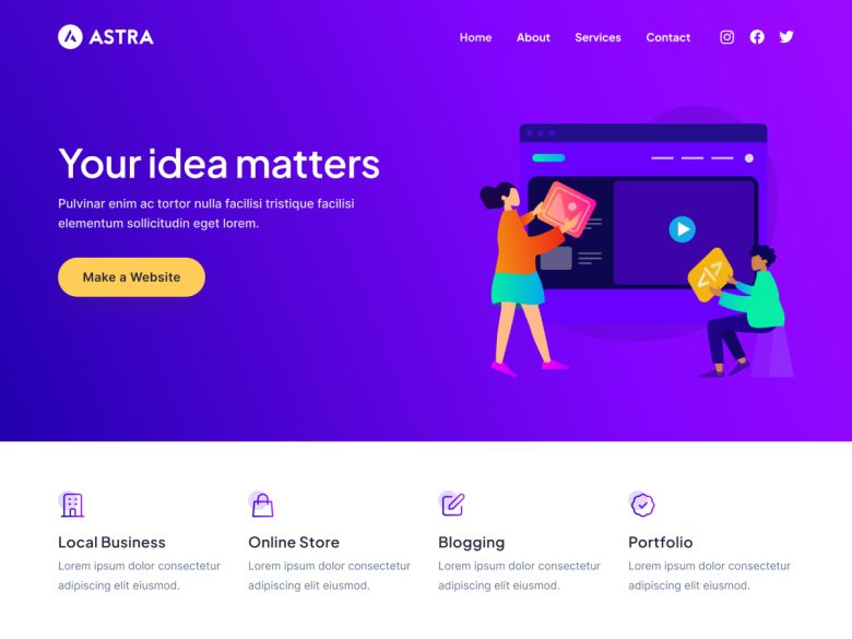
1. Astra
Best for: Business sites, portfolios, blogs, WooCommerce stores, and site owners who want a huge starter-template ecosystem.
Astra is still one of the safest first tests for a responsive WordPress theme because it is lightweight, widely adopted, and flexible enough for many site types without forcing a single design style.
Watch out: Do not install every companion add-on just because it exists. Start with the theme, a few starter templates, and the smallest plugin stack that solves the site goal.
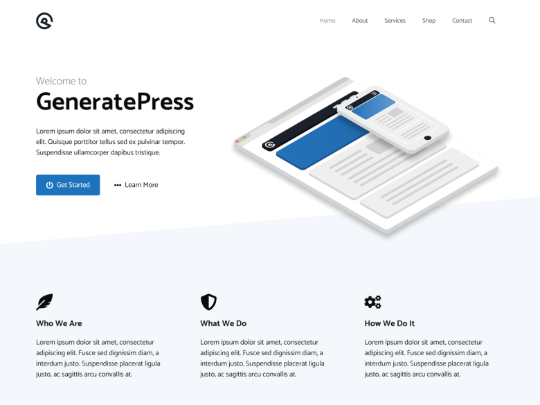
2. GeneratePress
Best for: Speed-focused blogs, documentation sites, affiliate sites, and simple business websites.
GeneratePress remains a strong responsive theme for people who care about performance, clean markup, and a site that does not fight custom layouts.
Watch out: The free theme is intentionally lean. If you want a large template library and deeper design controls, compare the premium workflow before committing.
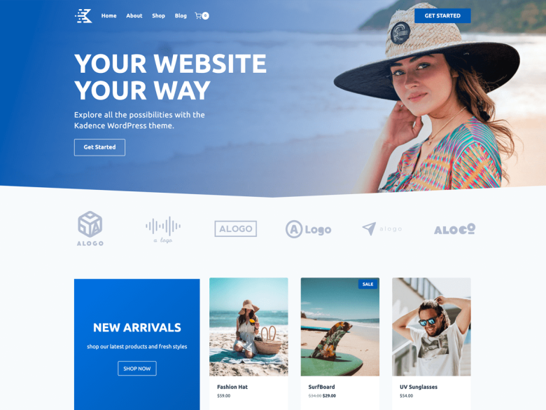
3. Kadence
Best for: Modern business sites, creators, WooCommerce stores, and users who want strong header, layout, and block-editor controls.
Kadence is a practical responsive theme when you want a polished customizer experience and block-editor-friendly design without immediately moving to a heavy builder.
Watch out: Keep global colors, typography, and templates consistent. Kadence gives you many controls, which can also create design drift.
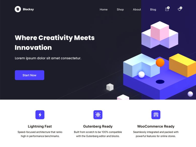
4. Blocksy
Best for: Design-conscious blogs, small businesses, shops, and sites that want a polished free theme with modern controls.
Blocksy is one of the strongest responsive themes for a modern WordPress build because it combines good defaults, WooCommerce readiness, and a fast editing experience.
Watch out: As with any feature-rich theme, test the final site with real plugins, forms, checkout, and caching enabled.
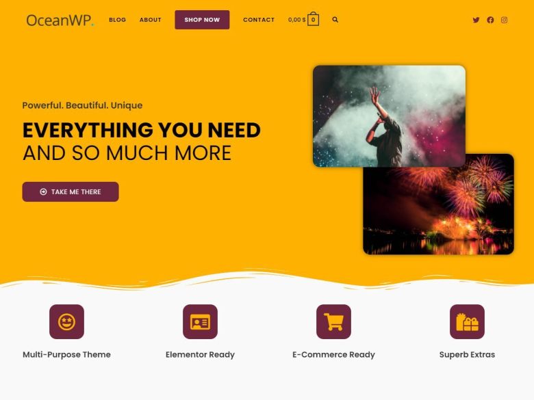
5. OceanWP
Best for: WooCommerce stores, business sites, and users who want a mature theme ecosystem with many demos.
OceanWP is still a strong responsive theme when the site needs WooCommerce flexibility and a broad demo ecosystem.
Watch out: Choose extensions carefully. OceanWP can stay lean, but it can also become heavy if every option is enabled.
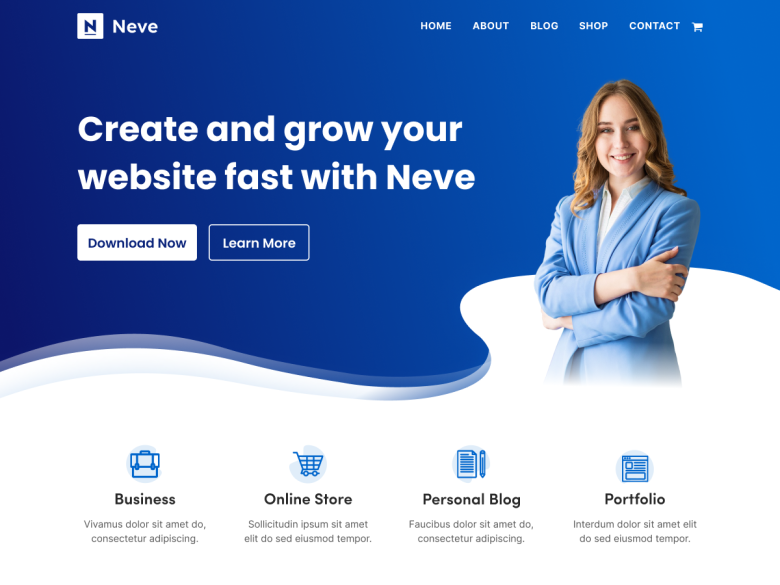
6. Neve
Best for: Small businesses, agencies, local sites, and users who want a fast theme from the ThemeIsle ecosystem.
Neve is a dependable responsive theme for fast setup, starter sites, and compatibility with common page builders.
Watch out: Starter templates save time, but replace demo copy and stock imagery quickly or the site will look generic.
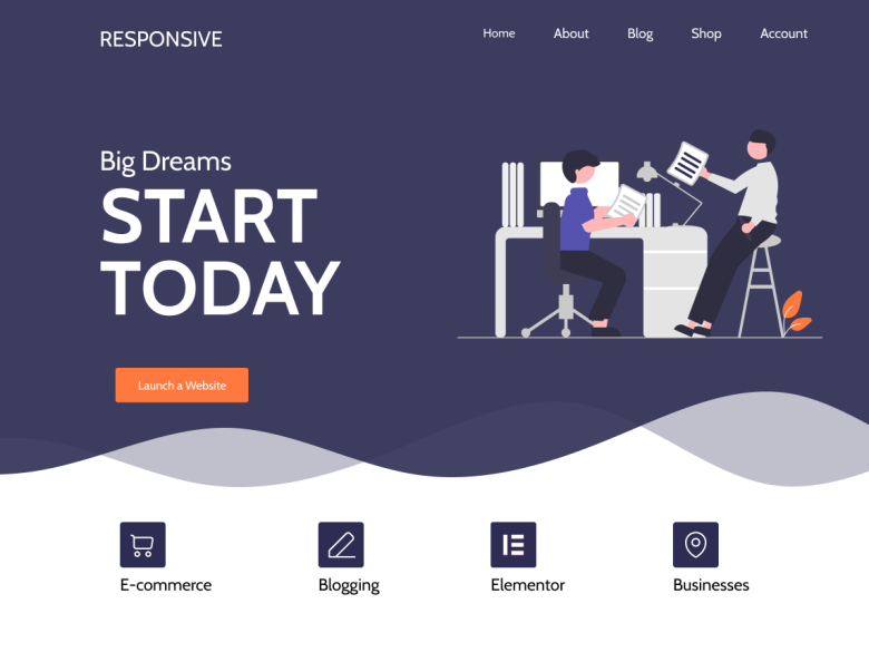
7. Responsive by CyberChimps
Best for: Beginners, small business sites, and users who specifically want the CyberChimps Responsive theme ecosystem.
The old WPArena Responsive theme review now belongs here. Responsive is still active in the WordPress.org directory, and its business templates, starter sites, and upgrade path make more sense as one option in a broader responsive-theme shortlist.
Watch out: Do not choose it only because the theme name says responsive. Compare it against Astra, Kadence, Blocksy, GeneratePress, OceanWP, and Neve with your actual site content.
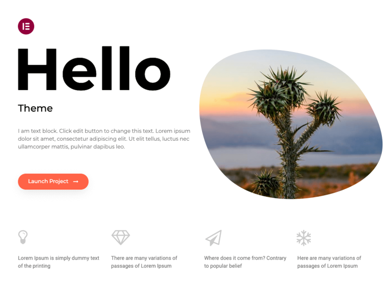
8. Hello Elementor
Best for: Elementor-first sites where the theme should stay minimal and the builder controls the design system.
Hello Elementor is responsive because it is intentionally minimal. It is a good base only when Elementor is the real design layer.
Watch out: Do not use it as a normal theme without Elementor. It is a blank canvas, not a complete design.
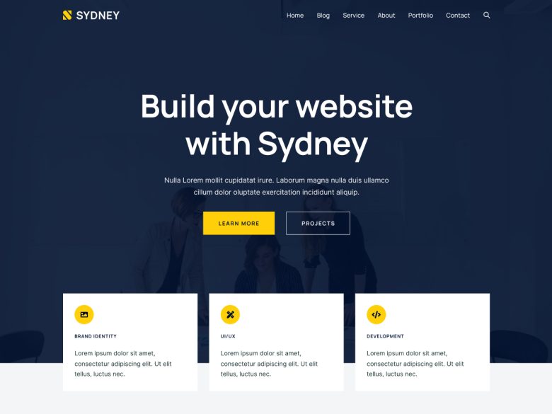
9. Sydney
Best for: Freelancers, local businesses, agencies, and straightforward service websites.
Sydney has stayed relevant because it gives business sites a responsive starting point with enough layout polish for service pages and homepages.
Watch out: Keep the homepage focused. Business themes often become cluttered when every service and badge is forced above the fold.
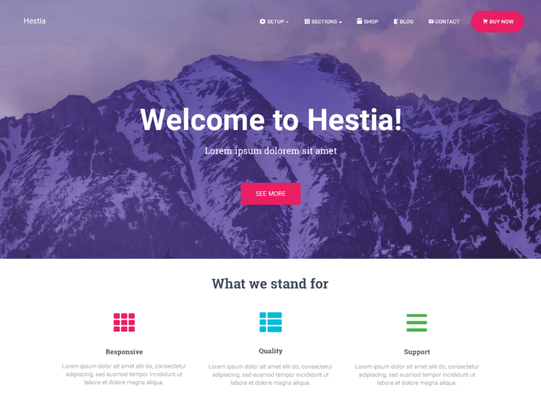
10. Hestia
Best for: Startups, local businesses, app landing pages, and small company websites.
Hestia remains useful when you need a compact responsive business site with a one-page feel and common plugin compatibility.
Watch out: One-page layouts can hide important content. Make sure service, pricing, contact, and legal pages are still crawlable.
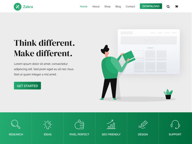
11. Zakra
Best for: Small businesses, blogs, portfolios, and users who want many starter-site choices.
Zakra is a solid responsive theme when you need a flexible starter site without committing to a heavier builder ecosystem first.
Watch out: Review template quality before importing. A multipurpose theme is only as good as the layout you choose.
12. Twenty Twenty-Five
Best for: Editorial sites, simple business pages, and teams that want to stay close to WordPress core.
Twenty Twenty-Five is not a commercial theme, but it deserves a place in a responsive-theme shortlist because it shows how far core block themes have come.
Watch out: It is best for teams comfortable with the Site Editor. If you want a packaged business demo library, choose Astra, Kadence, Blocksy, Neve, or OceanWP instead.
Responsive design checklist before you choose a theme
A good responsive theme should survive real content, not just a polished demo. Before you launch, test the homepage, blog posts, category pages, search, forms, menus, checkout, embeds, image galleries, and sticky elements on mobile and desktop.
- Navigation: menus, dropdowns, search, carts, and account links should work with touch.
- Typography: body text should be readable without zooming, and headings should not overflow on mobile.
- Media: YouTube, Vimeo, maps, ads, iframes, and galleries should scale inside their containers.
- Performance: responsive images, lazy loading, caching, and minimal scripts matter more than a pretty demo.
- Conversion paths: forms, checkout, pricing tables, lead magnets, and calls to action need mobile testing.
Where the old Responsive theme review fits now
The old standalone review of the CyberChimps Responsive theme and its business child theme was useful as a product review, but it overlapped this broader responsive-theme search intent. In this updated guide, Responsive is included as one current option instead of being isolated as a separate old review.
The same applies to the older responsive media-embed tutorial: its useful point is now part of the checklist above. Embeds are one of the first things that break a mobile layout, so test videos, maps, galleries, and ad units before you call any theme mobile-ready.
The old Bootstrap framework tutorial also belongs in this broader decision now. If you are building a custom theme in 2026, start from modern WordPress blocks, responsive CSS, accessible navigation, and a clean performance budget before reaching for a framework.
What changed from the old theme list?
The previous version included older recommendations such as SociallyViral, TechNews, Noozbeat, Neuton Mag, ColorWay, Zerif Pro, Clipper, Thesis, and several dated magazine or business themes. Some may still exist in some form, but they are not the strongest default recommendations for a new responsive WordPress site in 2026.
We kept the spirit of the article: helping readers choose a mobile-friendly theme. The difference is that the list now starts from active, realistic choices instead of treating every old responsive theme as equal.
Useful next reads
For narrower theme decisions, see our guides to choosing the right WordPress theme, WordPress speed optimization, eCommerce plugins, WooCommerce themes, education themes, LMS themes, and Genesis child themes.
Final recommendation
For most new WordPress sites, start by testing Astra, GeneratePress, Kadence, Blocksy, OceanWP, and Neve. Add Hello Elementor only when Elementor is the main design layer. Consider Responsive, Sydney, Hestia, Zakra, and Twenty Twenty-Five when you want a free-first theme and are comfortable building more of the final layout yourself.
The best responsive WordPress theme is not the one with the longest feature list. It is the one that gives your site the right layout, keeps mobile pages readable, does not slow down the stack, and still feels easy to maintain six months after launch.


Responses (6 )