Why do we need to create a mobile website? The principles behind designing a website for mobile devices are similar to those involved in designing a website for desktop and laptop computers. However, there are some specific strategies to keep in mind in order to maximize the effectiveness of the website when it is viewed on low-bandwidth devices and screens that cannot display a desktop-sized web page. By following the guidelines described below, you will be able to increase the efficiency, utility, and performance of your website.
 With Mysitemyway you’re getting more than just a theme, you’re getting a new way of approaching them. With our innovative separation of design from content, we’ve put everything you could every wish to customize into one easy to navigate option panel.
WPTouch Pro
Create stunning mobile + iPad versions of your website. Easily setup a rich mobile theme for iPhone, iPad, Android, Blackberry, Palm OS and Samsung touch mobile visitors, completely independent of your desktop theme. Following are the most outstanding iPad app websites, they all have well-presented content, have a look on these creative websites and get inspiration for your creativity. Keep File Sizes Small: Most desktop and laptop computers connected to the Internet with lines that are capable of over 500 kilobytes per second of downstream bandwidth. However, most mobile devices have just a fraction of this amount. Many users have to pay more if they utilize too much data. As a result, if your site is too large to load practically, users will avoid using it. You can keep file sizes down by using the PNG-8 or GIF formats for low-color images, JPEG for high-color and photographic images, palletizing your images whenever possible and choosing a compression ratio that provides sufficient quality without allowing any image to occupy too much space. A good rule to keep in mind is to keep a mobile web page's contents at 100 kilobytes or less. Cut To The Chase: Avoid welcome pages and unnecessary fluff. Any content that your user does not immediately need will clutter their screen, make it difficult to locate useful information and consume bandwidth. If the user pays per megabyte or is near their data allowance, excess content can even cost the user money. Determine what the most popular and useful portions of your site are and link to them directly from the main web page. Avoid big blocks of text and images that do not serve a direct purpose. Use Alternate Text: Many users surf the Internet with images turned off. This helps them to save bandwidth and also frees up real estate on smaller screens. When an image is not loaded, either by choice or due to an error, "Alt Text" is displayed in its place. By putting Alt text on all of your images, you will be able to tailor your site to users that are surfing with or without images enabled. A good rule of thumb is to describe what the image contains. For example, "lobby photo," "staff photo" or "company logo." You can add this text by inserting ALT="your text here" into an IMG tag. This also works for image tags that are embedded in anchor/"A" tags. Don't Use Flash: Adobe Flash files are notoriously large and require a great deal of CPU time and memory to run. Many mobile devices are not capable of viewing flash content at all. If this is the case, you could render the site unusable. Use images that are small in file size, text and basic links to get the job done. Give Users A Choice: Offer a "desktop version" or "full site" link somewhere visible. A common place to put this link is at the top or bottom of the page. This is invaluable for users of high-end devices such as large-screen smartphones and tablet computers. Offer your users the most commonly-needed functionality on the mobile website design and an extraneous content on the full site. Avoid Animated GIFs: Not only are these images tacky, distracting and unprofessional, they have tremendous file sizes. They also do not display correctly on a number of mobile devices. Avoid using these and instead display your content using optimized static images and text.Other User Resources:
Modernize - Flexibility of WordPress
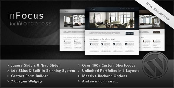
Modernize is a new era of WordPress theme. You can discover many new awesome features in this theme. For example ‘Page Builder’, it allows you to create page easily by drag-drop module. Moreover, it comes with many options on that Also, to change color elements, it won’t be a big deal anymore, with our new admin panel, you can access to almost of all elements color. Admin panel in this theme is a real feature rich. You can also create unlimited sidebar, choosing over 350 fonts or if you want to use your own, we provide a custom uploader. Modernize has 15 predefined background pattern but if you want to use your own background, again, we have a custom background uploader. You can also translate each element to your language via this admin panel. Live preview | DetailinFocus - Powerful Professional WordPress Theme
 With Mysitemyway you’re getting more than just a theme, you’re getting a new way of approaching them. With our innovative separation of design from content, we’ve put everything you could every wish to customize into one easy to navigate option panel.





Responses (0 )