


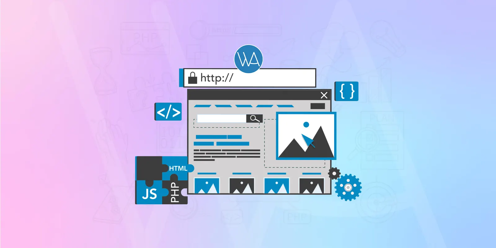
Are you planning to make your WordPress blog mobile friendly? If you haven’t decided yet, then must think about it and take a serious step as Google’s latest update of ‘mobilegeddon’ is effective since April 21st, 2015. So, if you want to protect your site from any sort of Google punishment, then go with mobile-friendly version. It is an absolutely right & lucrative decision to add a mobile-ready blog into the WordPress site, otherwise be ready to get dropped search engine ranking.
Why Is It Important To Pay In-depth Attention to ‘Google Mobile-Friendly Update’!
There is a great use of tablets and smartphones among people of different age groups to read the blogs and articles that have reached millions. Google gives incredibly seamless experience to the visitors. Thus, to understand this significance, Google announced its latest mobile-friendly update. No doubt, blogs own almost 30% mobile traffic and that you can figure out easily through the Google Analytics. None of us wants to lose the web traffic because it is essential to increase the visibility. If you run a website with non-mobile friendly blogs, then your chances to lose maximum mobile visitors are quite high. Creating this is an easy task, so let’s explain it via this post that will help you understand how to turn your WordPress blog into mobile-ready.Choose Mobile Friendly WordPress Powered Theme From Reliable Source
The very first and effective solution is to pick any responsive theme built with WordPress. This approach will ensure the accessibility of your blog section across hand-held devices integrated with multiple screen sizes. Indeed, these themes provide help in loading blogs on multifarious screen resolutions with a uniform appearance. A number of modern themes are available free of charge, so pick any one of them suitable your requirement. If your budget allows you to spend, then you may select a premium theme and make your site well-organized in all the manners.Try To Customize Responsive Blog Theme
Though you use the responsive theme for your blog, but still you might feel to make it more responsive. For this purpose, the best way is to use CSS media queries, because such media queries help you modify the properties of the theme in accordance with the requisites of the device. The easiest media query forms always need manifold styles for distinct screen compatibility using the following markup:<link href=”printstyle.css” type=”text/css” media=”print” rel=”stylesheet”/>
<link href=”screenstyle.css” type=”text/css” media=”screen” rel=”stylesheet”/>With this code, you will get varied style sheets and all of them will allow your blog to get loaded on distinct devices and their multiple screens.


Responses (1 )